
When I arrived to measure Lindsay’s existing space in downtown Victoria, Texas, its potential was evident right away. I knew with a few key modifications, it would be an even more perfect space for entertaining – setting it up for a great transformation. I always enjoy the challenges that kitchen designs present, and finding solutions is one of my favorite ways to get creative.
In addition to the kitchen, Lindsay knew she wanted to rework the layout of her laundry room as well. With my design tasks defined, I was so excited to begin this kitchen and laundry room remodel.
There were a few key goals we wanted to achieve in this remodel:
- Improve cabinetry layout
- Optimize & reconfigure existing ample storage spaces
- Resolve the tight clearance between the fridge & existing island
- Add a formal pantry
Along with that, the main goal in the Laundry room was to incorporate a drop zone near the garage entry into the house.
Here was the existing layout:

Since Lindsay was open to moving existing plumbing & electrical, I wanted to explore what I considered to be the most “extreme” option in this remodel and see just how much I could move around to really open up and simplify this space.
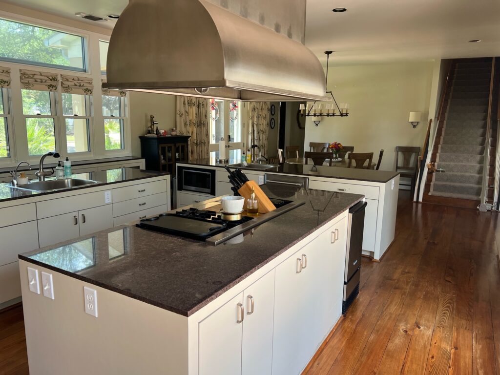
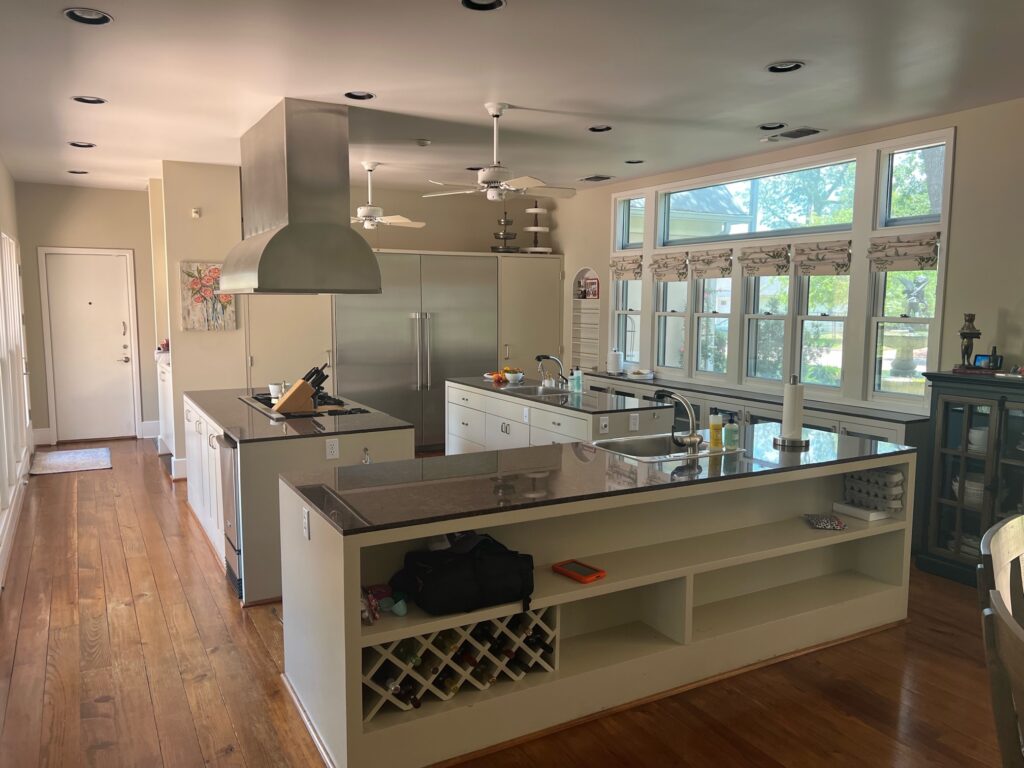
One of the first things I knew I wanted to work on was the range & vent hood in the middle of the room. The vent hood and three separate islands were really causing a visual block and lack of flow in the main cooking area.
I also knew I wanted to use the kitchen windows as a focal point in the space, so the best option was to move the range to the far wall with the fridge, which in turn, would move the fridge over to the left slightly.
Lindsay was very open to moving plumbing and electrical, so by moving the range, fridge, and sink, we solved one of our main problems – the tight clearance between the fridge and cabinets.And with the existing space where the two parallel islands were, of course, I had to make it a large, gorgeous island. Backing everything up to the walls and removing that vent hood opened up the space so much and really helped the circulation in that area of the kitchen. Plus, by relocating the sink under the widows and flanking them with the cabinetry, the windows became a key focal point in the design, rather than being apart from the design.
In addition to moving the fridge, we also downsized from a commercial-style fridge to a standard-size fridge and added a freezer drawer to the end of the newly designed island. Before landing on the final design for the island, as we worked through revisions and different iterations of the space, Lindsay & interior designer, Madeline, with Fox & Hawn suggested relocating the freezer to the island to free up even more wall space. Moving the freezer area to the island allowed for more countertop space & upper cabinetry to symmetrically frame the newly placed range.

After this, the remaining issues seemed to fall into place with the room’s flow. I removed the third island dividing the dining area from the kitchen, which opened up space beside the windows for a pantry and more cabinetry.
Then, to expand the design further, we decided to experiment with a pass-through serving bar on the wall behind the existing dining area. Opening up that wall to expose the existing cabinetry along with adding a pop of color created another key focal point in the remodel design, perfect for hosting & entertaining guests. In doing this, I was also able to mirror the hallway archway that existed beside that area to add visual consistency.
Overall, the redesign of the kitchen was all about simplifying the space. The three existing islands were reduced to one large, open island in the main kitchen area, and all the appliances were shifted around or pushed to the wall, making the space’s function much more straightforward and sensible.
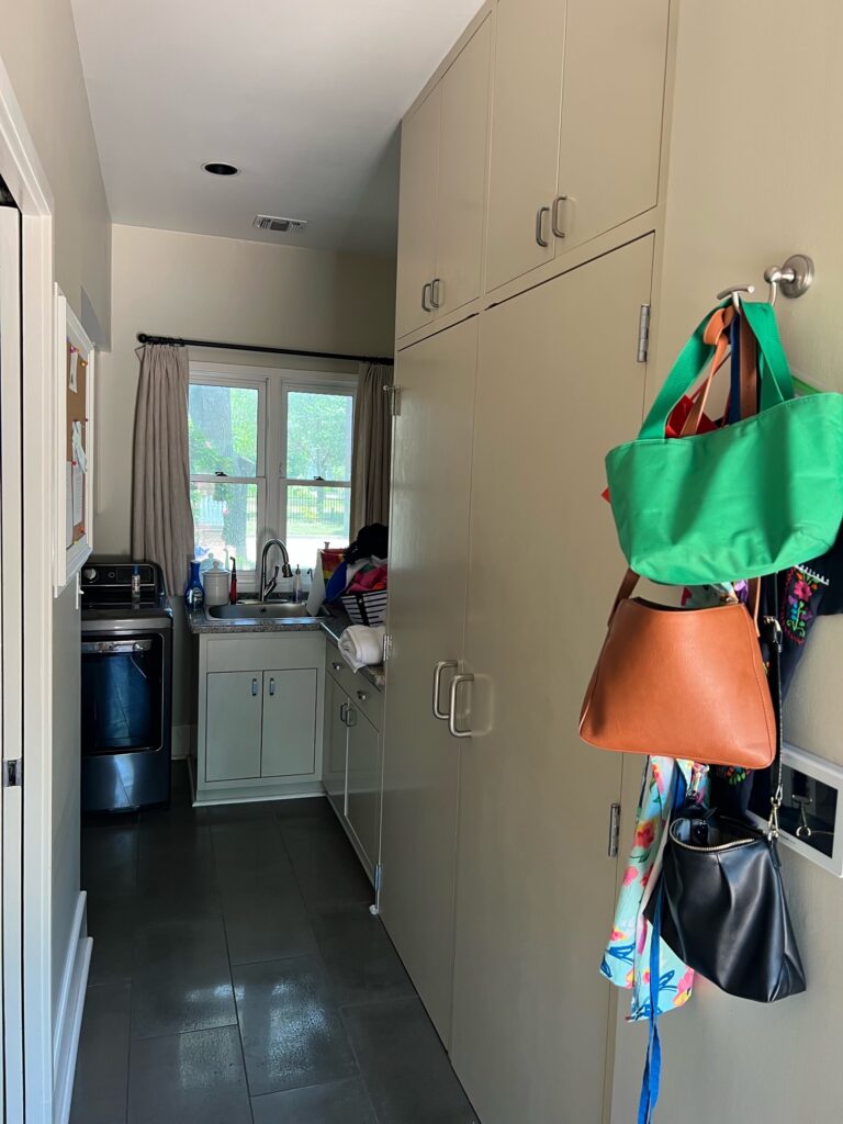
Then it was time to move on to the laundry room. Originally, there was a small, recessed key-drop area between the kitchen and laundry room, but after pushing that wall out to accommodate the new fridge location & maximize kitchen square footage, I rotated that key-drop area, and placed it in-line with the existing laundry space.
In my floor plan, I added a large mud bench on the right wall as you enter the laundry room, perfect for serving as a “drop zone” when walking in from the garage. Right next to that, I filled the rest of the wall with built-in shelves for basket storage, upper cabinets, & a hanging rod. I kept the sink, washer, and dryer on the back wall of the laundry room, but left open space in front of them for additional hanging space.
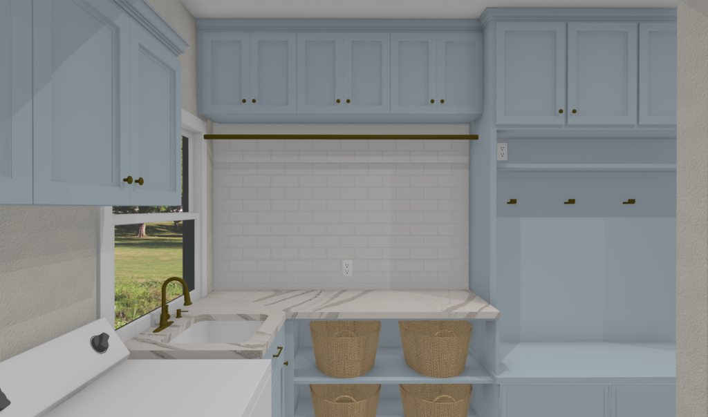
The biggest transformation in the laundry room wasn’t the layout, but the optimization of the layout by adding better storage.
With my knock-out list of goals completed, I sent over the plans and 3D model to my client. The layout was much more simplified and functional, and I couldn’t wait to see the plans come to life!
Here’s a look at the final remodel floor plan:

Design Team:
Floor Plan Design + 3D Model: Grey Feather Design Studio
Builder: Hunter Custom Homes
Interior Designer: Fox & Hawn Home
Do you have a space you’re interested in remodeling? Fill out our contact form at www.greyfeatherdesignstudio.com to tell us more about your project and see if our services are a good fit for you.

